- How to get gorgeous looking fonts on Ubuntu / Linux Mint
- Step 1 — Get better fonts
- Step 2 — Tweak your .fonts.conf
- Some background
- Step 3 — Configure font settings
- Configure system fonts — KDE
- Gnome
- Configure web fonts — Chrome/Firefox
- Chrome
- Firefox
- Final Results
- Ubuntu default — Chrome
- Ubuntu TWEAKED — Chrome
- Windows 8 — Chrome
- Monospace
- Droid Mono vs Ubuntu Mono
- What tweaks have been done
- Different fonts for desktop and web
- So do these tweaks matter
- Additional Notes
- References
- 43 Comments
How to get gorgeous looking fonts on Ubuntu / Linux Mint
Fonts on linux have long been an issue due to various reasons like the BCI patent by Apple, lack of free quality fonts etc.
However over time things have changed and now its possible to get your linux system fonts look as good as, or even better than a mac or windows 8 as far as fonts are concerned.
In this post I am going to show you couple of simple tricks that can make the fonts of your linux system look amazing!!
However first there are a couple of things to know about how the tricks work. We are mainly going to do 2 things. First is, get better fonts for the system.
Second, we are going to tweak the «.fonts.conf» file in the home directory. The «.fonts.conf» file allows a user to override the system font settings like antialiasing, hinting, auto-hinting, sub pixel rendering etc.
The tweaks shown in the post should give identical font rendering on any linux distro provided that BCI hinting (Byte code interpreter) is available (which it is on most modern linux distros since the bci patent has now expired).
Step 1 — Get better fonts
Ok, so the first step is to get better fonts for our system. All of these fonts are free and available from the google webfont store at the following url
Here is a list of the fonts you shall need.
1. Droid Sans 2. Droid Sans Mono 3. Droid Serif 4. Noto Sans 5. Noto Serif 6. Open Sans
Download the font files. Google would give all of them in a single zip file. Make sure you download all styles and all encodings.
Once downloaded, extract them in the following directory.
And they would get installed.
Step 2 — Tweak your .fonts.conf
The next step is to tweak the font rendering through the .fonts.conf file. This file exists in your home directory. In newer versions of ubuntu, if this file is not already there, then create one. The file is in xml format, and through its syntax we can define various settings on per font basis. Like replace a font by another, use autohinting for a certain font, don’t use for another and so on.
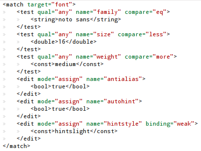
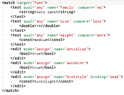
So copy the xml from the following url to your .fonts.conf file
If you already have a fonts.conf file then take a backup first. Later if you decide to revert,
Make sure you installed the fonts mentioned in the previous step. After this you need to configure few font settings in kde/gnome, firefox and google chrome. Move on to the next section or continue reading to know more about the fonts.conf tweaks.
Some background
The ubuntu wiki page on fonts has a font configuration xml provided by Obi Bok. It focuses on getting windows xp style clear looking fonts on your linux system with microsoft fonts. For this you need to install the microsoft fonts like Arial, Verdana, Tahoma, Georgia, Times New Roman etc.
On Ubuntu the fonts are available in the repository by the package name ttf-mscorefonts-installer. By installing those fonts, and putting the xml setting in your fonts.conf file your fonts should look like that of windows xp. Infact they would look better than windows XP.
Those microsoft fonts might work well for you, but I think they are out dated and its time to get some modern fonts.
So I modified the original fonts.conf by Obi Bok to suit more to Droid, Noto and Open Sans font families. You will see the results in a short while.
Step 3 — Configure font settings
Now we shall be configuring the desktop (KDE or GNOME) and the web (Firefox or Chrome) to get better font renderings according to our plan.
Configure system fonts — KDE
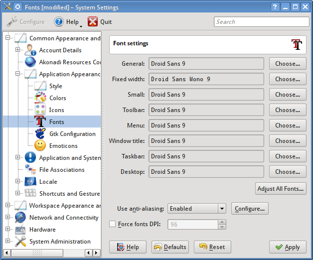
On KDE, launch System Settings, go to «Common Appearance and Behaviour > Application appearance > Fonts».
Select «Droid Sans» size 9 for all fonts. For «fixed width» font select «Droid Sans Mono» size 9.
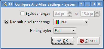
In «Use anti-aliasing» dropdown, select «System Settings». Leave force font dpi unchecked.
On KDE the subpixel rendering cannot be enabled from the .fonts.conf file. Adding the following will have no effect
Hence it has to enabled from the Font settings box.
The subpixel rendering setting for kde is stored in the file «~/.kde/share/config/kdeglobals» in a field named «XftSubPixel=rgb».
Thats it. That should make your fonts look better. Try logging out and relogin, if the settings don’t take effect properly.
Gnome
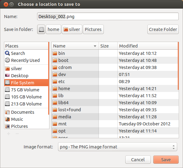
The newer gnome desktops dont have a direct option to change the fonts. Use a tool like gnome-tweak-tool and change the fonts.
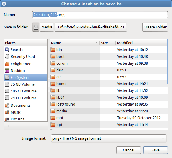
Gnome with the default Ubuntu Font at size 11pt.
Gnome with tweaked Droid Fonts at size 10pt.
Configure web fonts — Chrome/Firefox
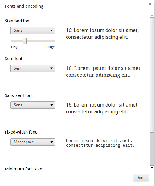
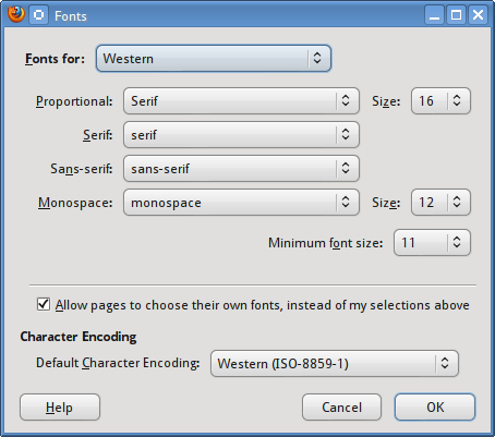
Now open the browsers google chrome and firefox and go to font settings area. And use the following settings
Standard Font — Sans
Serif Font — Serif
Sans-serif font — Sans
Fixed-width font — monospace
Chrome
Firefox
That much is enough for configuring the browsers.
Final Results
The dialog boxes shown above already show the final rendering of the fonts on the desktop. Now I am putting up some screenshots of how the fonts look on webpages.
Here is quick comparison between our font tweaked google chrome on linux and Google chrome with default fonts on windows 8.
Ubuntu default — Chrome
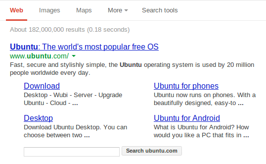
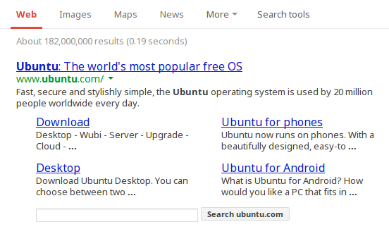
On a fresh installation of Ubuntu 12.10, google chrome shows google.com like this
Ubuntu TWEAKED — Chrome
Here is the same result with our font tweaks applied. The fonts look rich and well fed.
Windows 8 — Chrome
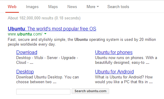
And for some comparison take a look at how Windows 8 looks
It should be easy to spot out right away how rich the fonts on ubuntu look, when compared to windows 8. I have not checked with mac. May be you should try that and let me know the results.
Monospace
For monospace we have 2 great choices. Droid Sans Mono and Inconsolata. However each has got issues.
1. Droid Sans Mono does not have a Bold version. So making them bold looks ugly on webpages. Inconsolata has got a bold version.
2. Inconsolata is smaller in size than Droid Sans Mono. So at the same size of 9pt or 12px Inconsolata looks much tinier than Droid Sans.
3. Comparatively Droid Mono is clearer than Inconsolata.
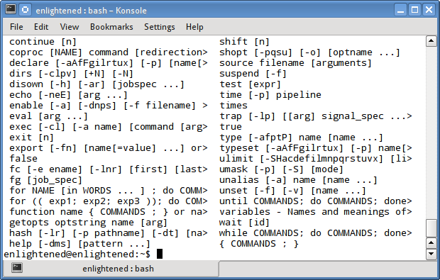
Here is a screenshot of how each looks on KDE with full hinting.
So Inconsolata at 10pt looks like Droid Mono at 9pt. Also note that Droid Mono looks nicer than Inconsolata.
Both are at full hinting with autohinting disabled.
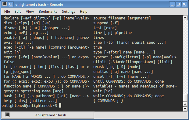
Droid Mono vs Ubuntu Mono
Droid Mono at 9.5pt in Konsole/KDE with full hinting
Ubuntu Mono at 11pt in Konsole/KDE with slight hinting
What tweaks have been done
Now I shall explain the tweaks done to your font settings.
1. Arial, Tahoma, Verdana has been replaced by ‘Noto Sans’. This will affect the webpages.
Those 3 fonts are used a lot on websites, because most websites are still living in the old age. So we replace them with Noto Sans, a modern and beautiful looking font from Google.
2. Georgia, Times New Roman replaced by Noto Serif. This will also affect the webpages.
Same reason as before, Noto Serif looks very good.
3. Droid Sans is made the default sans and sans-serif font. This is used on desktop and also on webpages as fallbacks.
4. Droid Serif is made the default serif font.
5. Droid Sans Mono is the default monospace font. This will be seen in the terminals and code editors.
Different fonts for desktop and web
It is important to note that we are using the Droid fonts for the desktop and the Noto fonts for the web (through replacement trick). We could have used the same droid fonts on the web too but it would not work very well for a couple of reasons.
1. To make Droid fonts look the best on the desktop we use bci hinting (by disabling autohinting). Due to this the fonts look very good, but there is a tradeoff. At size 12px ( which is very common on websites ) the font look tiny. Using such a tiny font on a webpage hinders readability.
2. With auto hinter, the size would go up but rendering quality is hampered on the desktop.
3. On web pages Noto Sans with autohinter looks more clear compared to bci hinter, but slightly stretched compared to bci.
So to get the best looks on both the desktop and the web, I came up with the solution of using Droid on the desktop with BCI hinting, and Noto on the web with autohinter.
So do these tweaks matter
The tweaks shown above were tested on LCD monitor at 96 dpi (not sure if that was the actual dpi of the monitor).
On laptops fonts perform better, so even if you were to use a less nicer or a little bad looking font, it would look good on laptops/pads where the pixel density is higher.
Moreover if you are using gnome, then your fonts are by default 11pt which is bigger than the 9pt/10pt examples shown above. At big sizes fonts again perform better. Thats the reason the Ubuntu fonts look good enough on gnome. At smaller sizes the performance or the clarity becomes more testable.
That was the desktop part. On webpages fonts come in various sizes and 12px and 13px are the most common. So this is the place that needs most of the beautification. So even if you are content with the gnome desktop with ubuntu font, the web fonts are surely not very upto the mark, as already shown above.
So try out the tweaks and suggest me further improvements. I hope to continue developing the .fonts.conf file to tweak and tweak more the font settings to achieve don’t know what. Have fun till then!!
Additional Notes
Google Chrome is buggy when it comes to following the rules mentioned in the .fonts.conf file. It does not obey the pixelsize rules. This does not matter unless you want to tweak the fonts.conf file yourself. Firefox follows the rules very well.
In browsers, the fonts.conf hinting rules might not be followed if the actual fonts are not available on the system but present on the webpage through css3. In that case the default hinting rules would be followed.
On chrome, if the fonts are present on the system then fonts.conf rules shall be applied.
On firefox if fonts are loaded via css3 then the fonts.conf rules shall not be applied and default antialiasing will be applied always. However if the same fonts are not loading by css3, then the fonts.conf rules shall be applied.
References
This is a very old and probably the first article that ever came up talking about font issues on linux and how to get windows like fonts on various linux distros.
http://avi.alkalay.net/linux/docs/font-howto/Font.html
This is an excellent article that explains various fonts.conf settings like antialiasing, bci hinting, auto hinting. Its a must read.
https://wiki.archlinux.org/index.php/Font_Configuration
The syntax of the .fonts.conf file is explained here
http://linux.die.net/man/5/fonts-conf
The original xml on which my tweaks are based can be found here
https://wiki.ubuntu.com/Fonts
A Tech Enthusiast, Blogger, Linux Fan and a Software Developer. Writes about Computer hardware, Linux and Open Source software and coding in Python, Php and Javascript. He can be reached at [email protected] .
43 Comments
- BramApril 26, 2021 at 7:07 pm I’ve taken the time to compile a list of all fonts in a gallery with preview images for all the Ubuntu packages available atm: https://bneijt.nl/pr/ubuntu-fonts/
